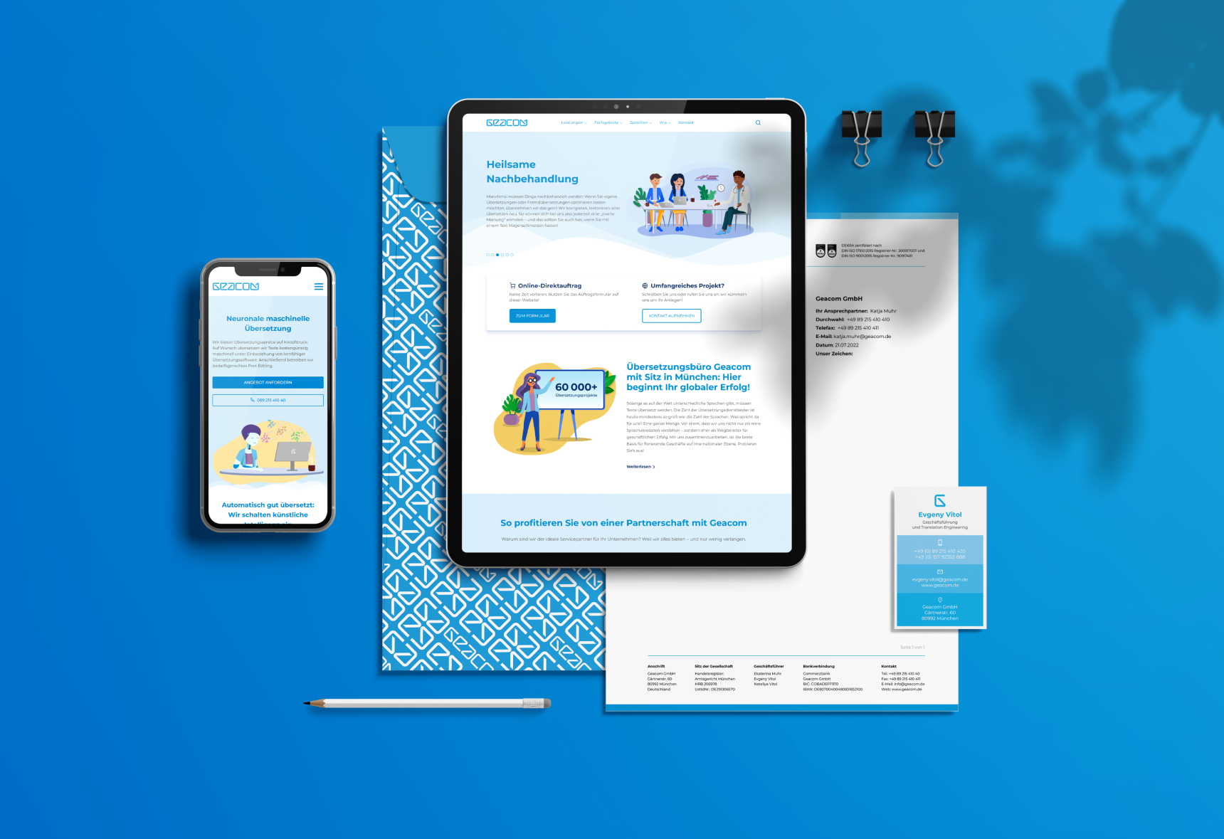
Geacom GmbH is an innovative translation agency based in Munich, operating in the market for over a decade. The company stands for the highest quality in the translation industry, supported by the use of cutting-edge technologies. This advanced approach enables Geacom to deliver translations not only quickly but also with high quality.
Geacom already had a website, but it was outdated both visually and technically. Despite its once innovative and striking design, it no longer met the modern requirements of a contemporary translation agency. Both the design and the color scheme did not reflect Geacom's advanced and contemporary positioning. Additionally, the website suffered from suboptimal search engine rankings, which affected its visibility and accessibility for potential customers. To strengthen Geacom's online presence, a comprehensive redesign of the company's website was necessary.
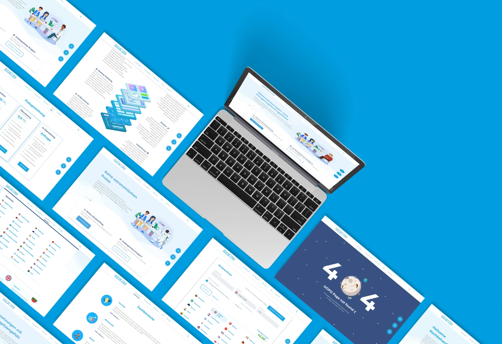
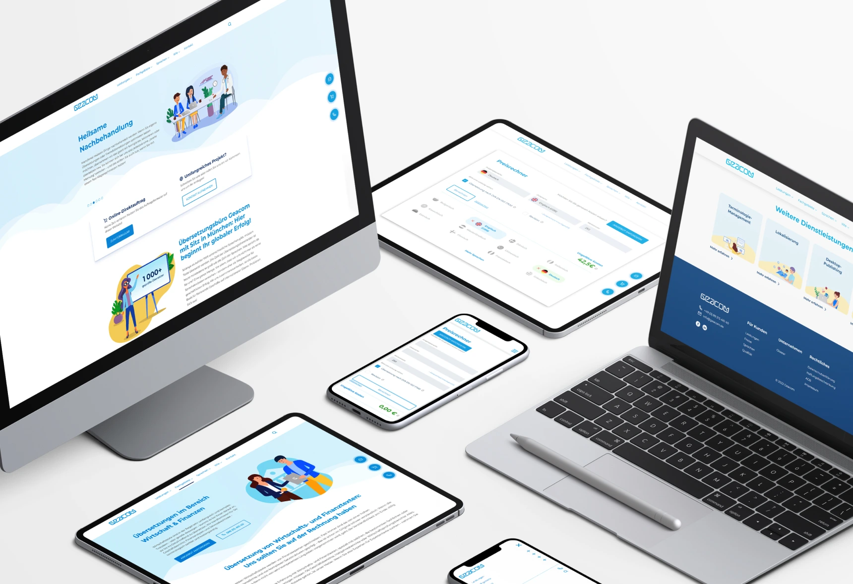
Our approach began with a detailed market analysis, where we examined the websites of leading translation agencies in terms of structure, content alignment, and the use of specific keywords. Based on the insights gained, we developed an entirely new homepage for Geacom. This new design features improved Google rankings, which directly led to an increase in website traffic and customer inquiries. Through this strategic realignment, Geacom was able to significantly strengthen its position in the digital space and successfully present itself as a modern translation agency.



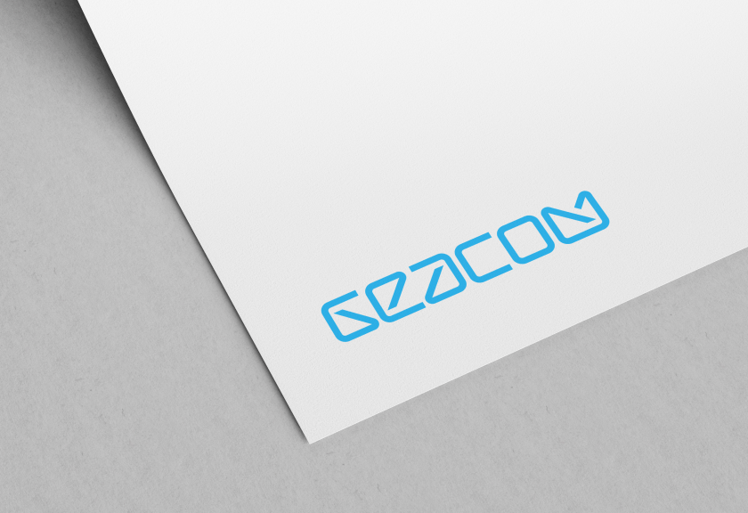
In our creative process for logo development, we designed a unique wordmark logo for the client, composed entirely of custom-designed letters, all of which are the same size. The design of these letters draws inspiration from a computer font, immediately establishing a connection to the world of Artificial Intelligence—a technological field that also plays a role in Geacom's services. The 'G' in the logo was specifically crafted to function both as a favicon for the website and as a recognizable symbol in social media, giving the brand a distinctive and memorable icon.
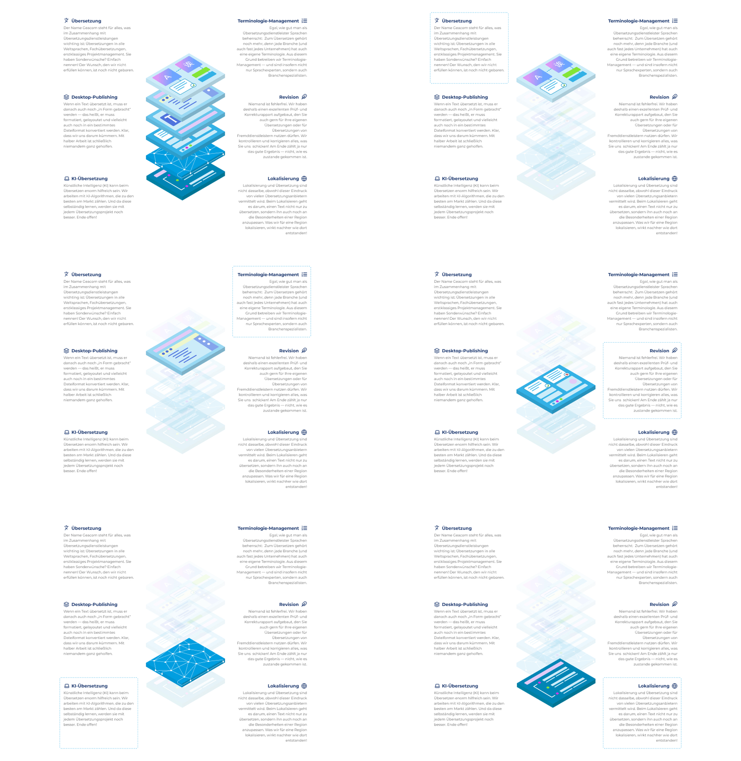
To visually highlight Geacom's various business sectors and service areas, we created a unique series of icons. These two-dimensional symbols are highly impactful and designed to be immediately understandable, emphasizing the company's customer-friendliness and accessibility. With their clear and simple design, these icons make it easier for users to navigate the website and underscore Geacom's commitment to intuitive and user-centered communication.
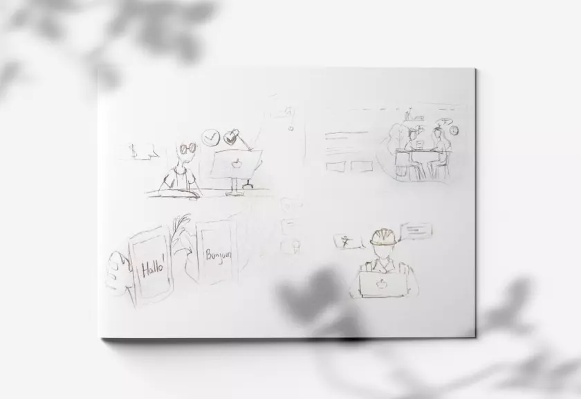
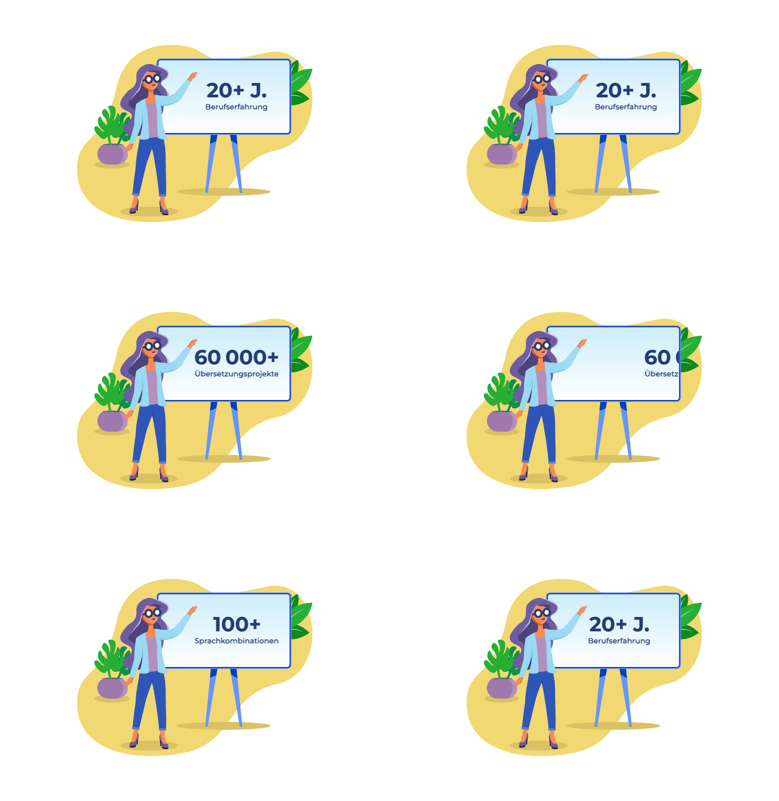
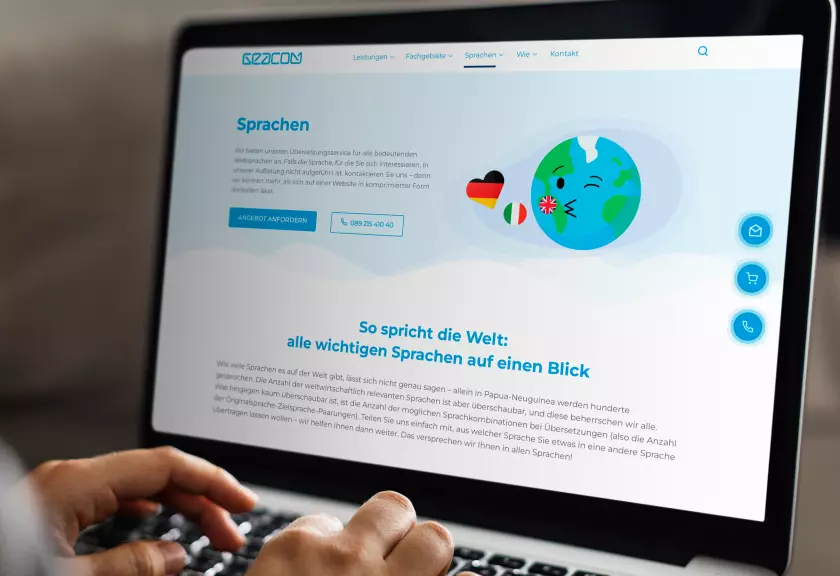
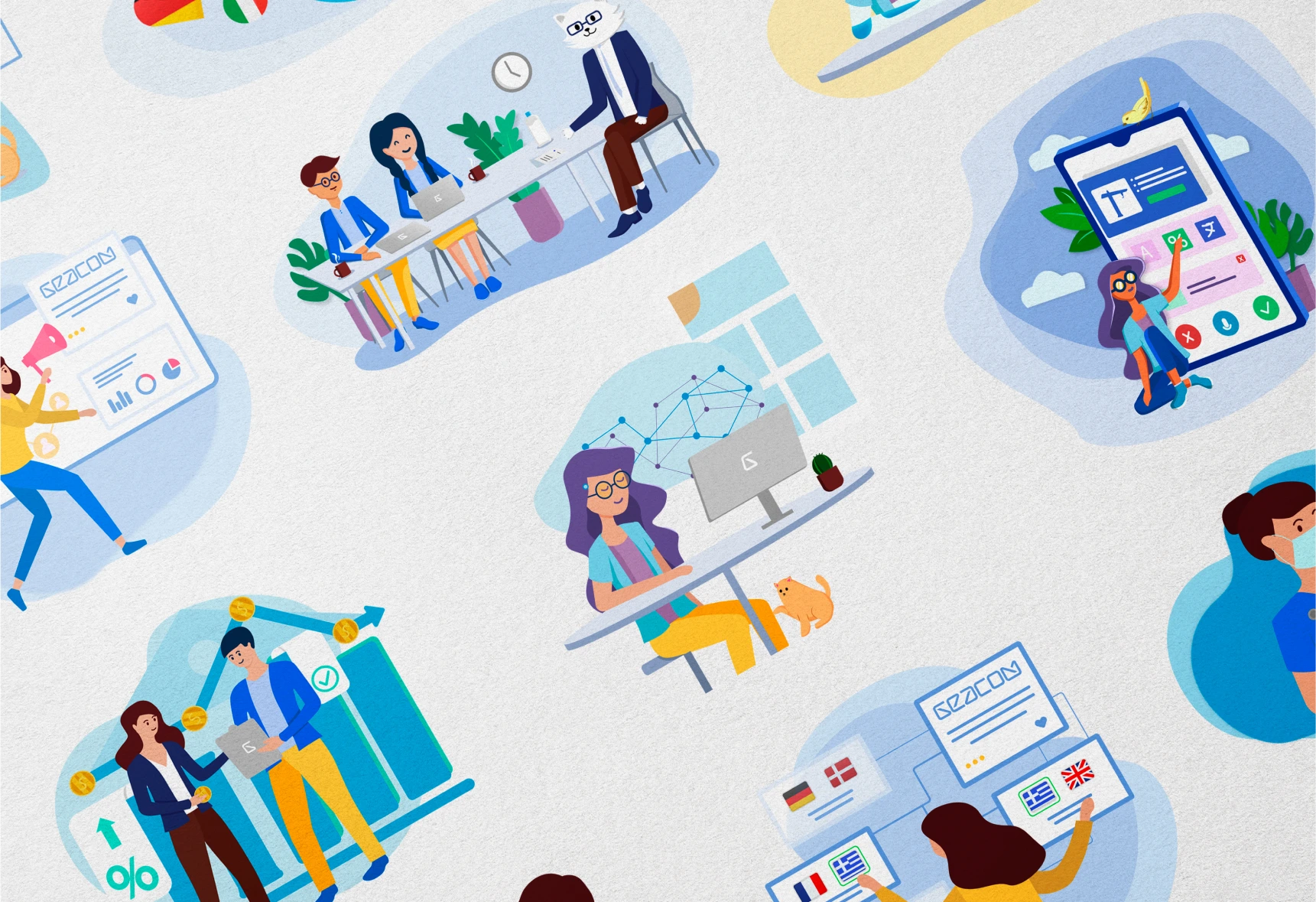
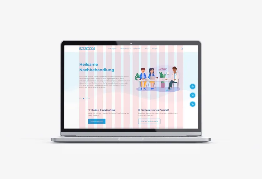
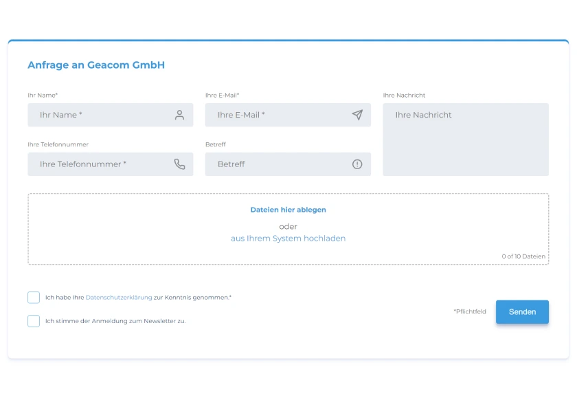
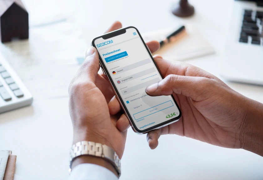
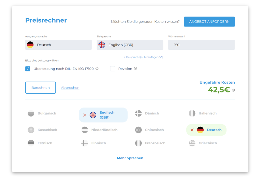
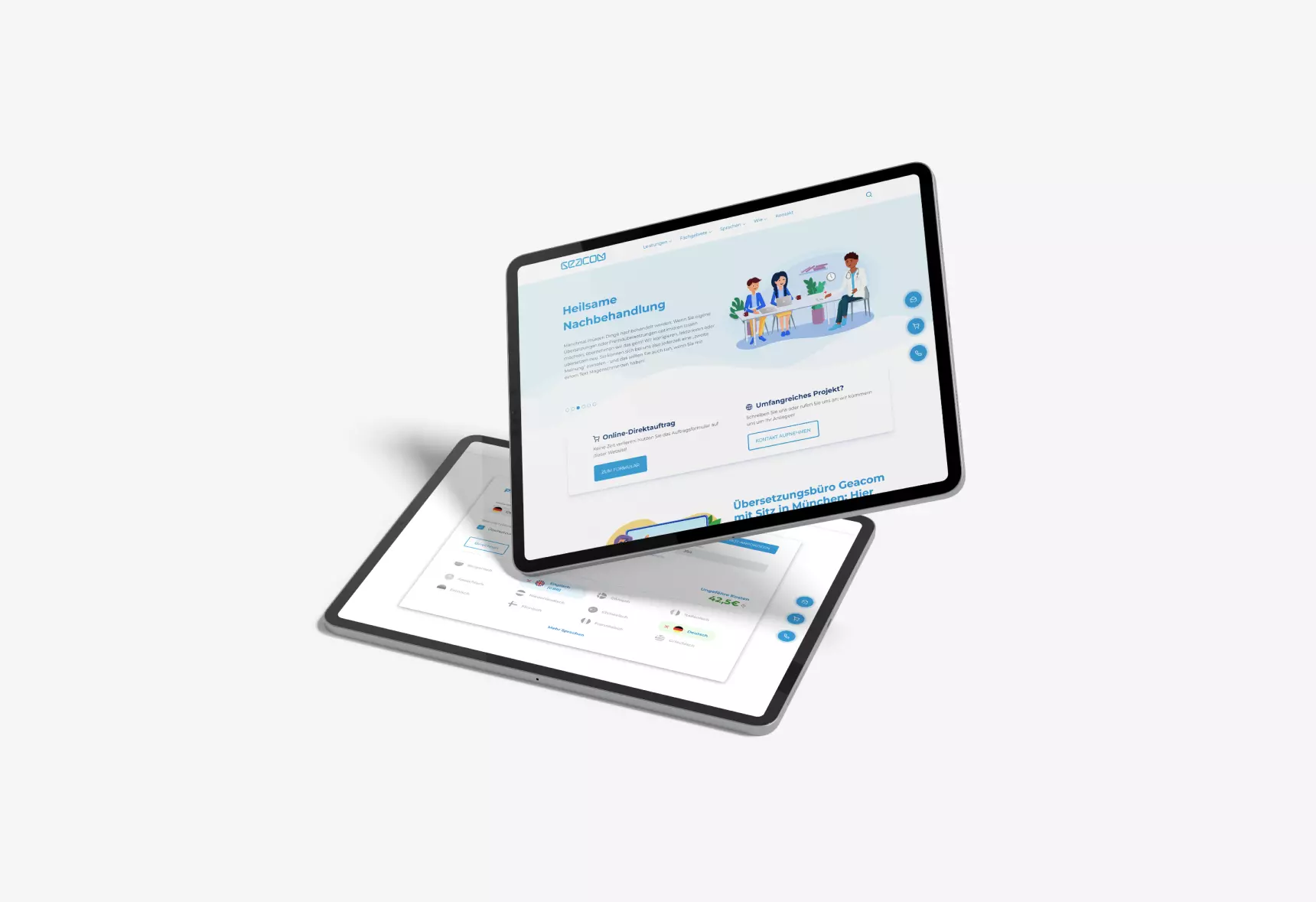
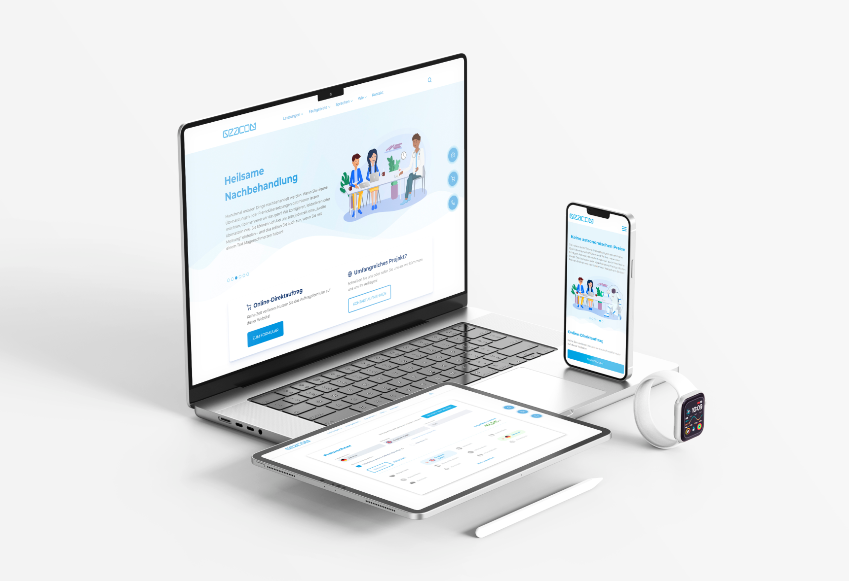
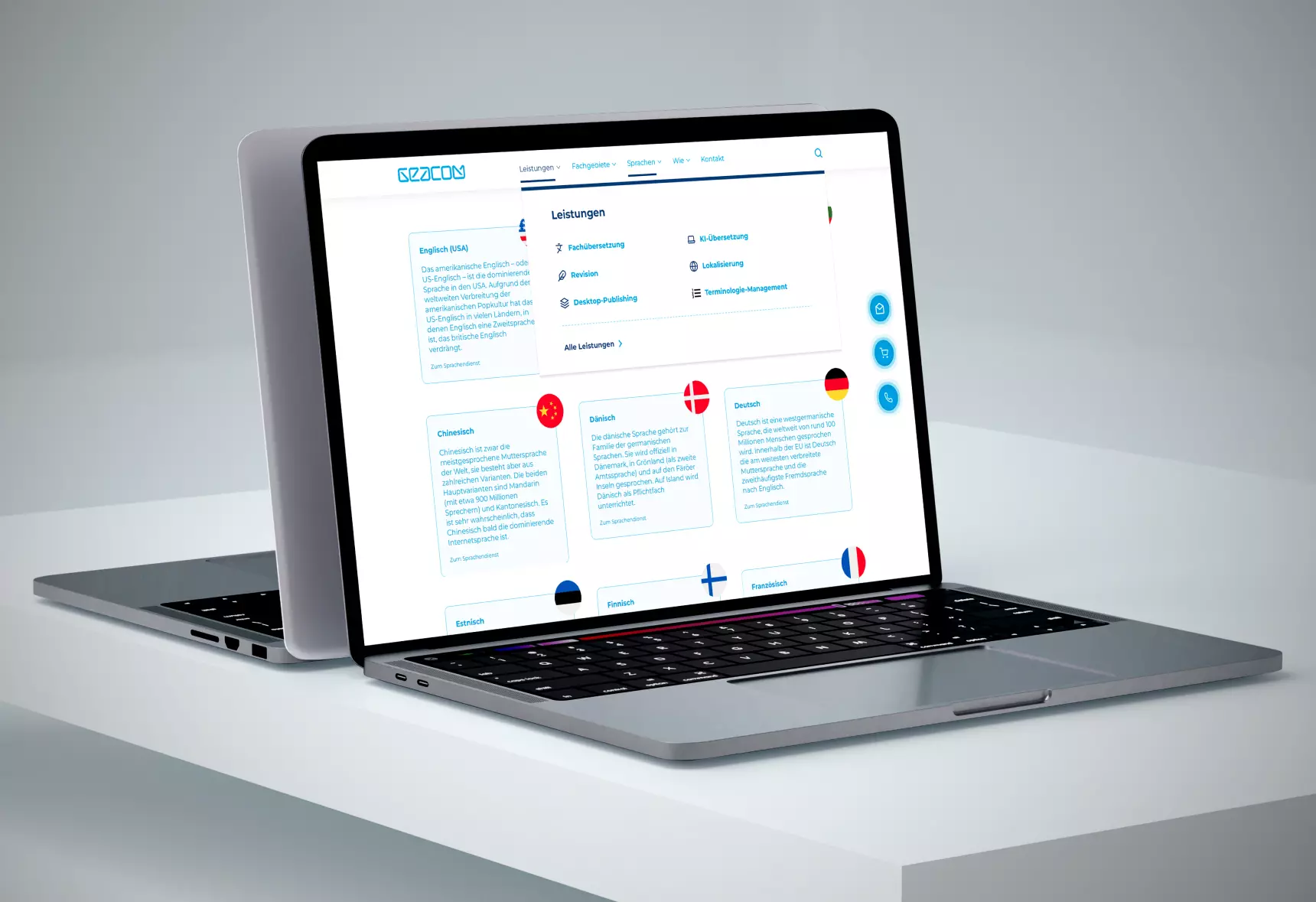
Our approach to web design aimed to create an extremely clear layout that ensures published content always takes center stage, without being overshadowed by unnecessary elements. By implementing a 12-column Bootstrap grid system, we ensure a responsive design that provides optimal display on various devices – whether it's a laptop, tablet, or smartphone – and looks appealing on any screen size.
