L.TXT — the specialist and strategic partner for language service providers.
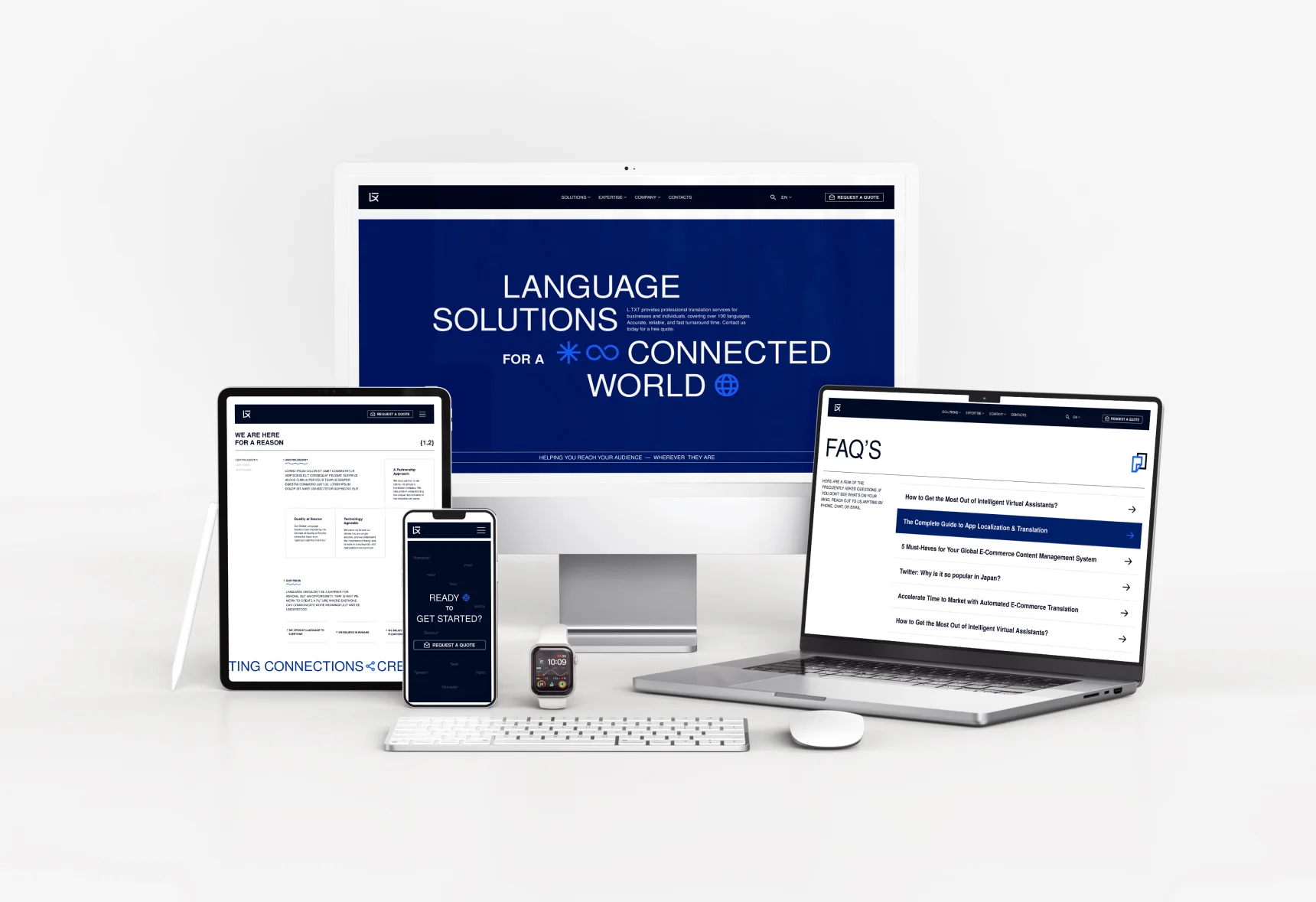
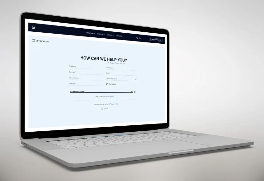
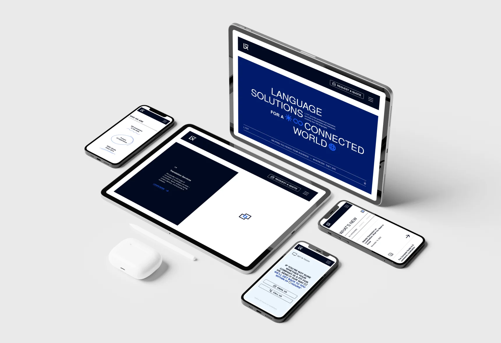
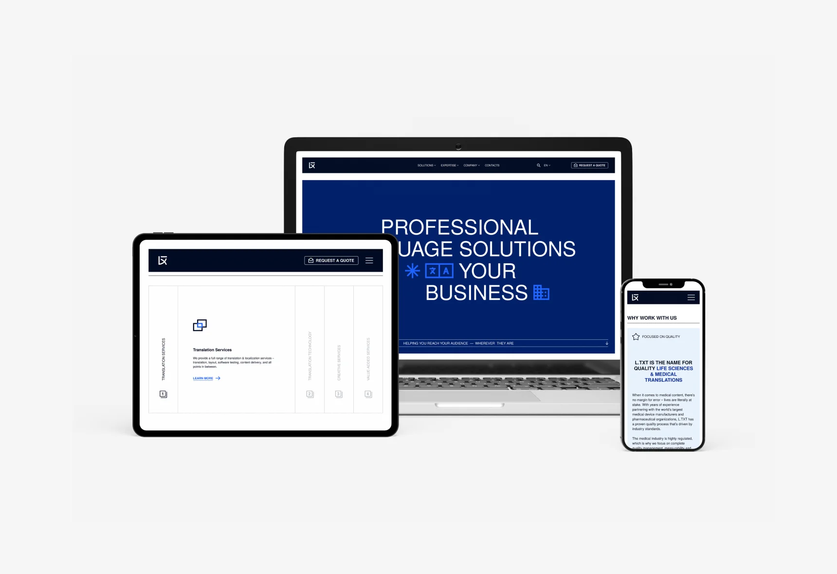
L.TXT already had a corporate website, but the design was outdated and did not reflect the company's positioning as a modern and dynamic service provider. Additionally, the search engine ranking was poor, with the site appearing far behind competitors in Google search results. A new corporate website with a custom design was needed.
We scrutinized well-ranked competitor websites, analyzing their structure, content, and keywords. Based on these findings, we developed an entirely new homepage for L.TXT. This new site ranks significantly better on Google than the original, leading to increased traffic and customer inquiries.

The L.TXT logo was inspired by Japanese minimalism and calligraphy. It was important to include all the letters of L.TXT in the logo without making it look cluttered. The foundation was formed by Japanese Kanji ideograms, which symbolize various concepts.

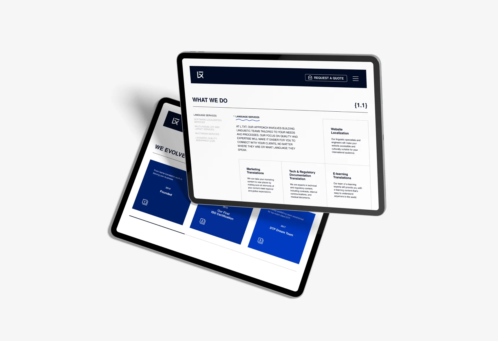
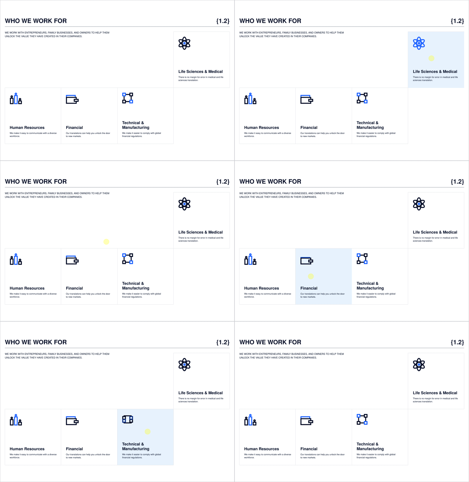
We developed graphic icons to represent various business sectors and service areas. These two-dimensional icons carry strong symbolic meaning and are easily recognizable, emphasizing L.TXT's customer-centric approach.
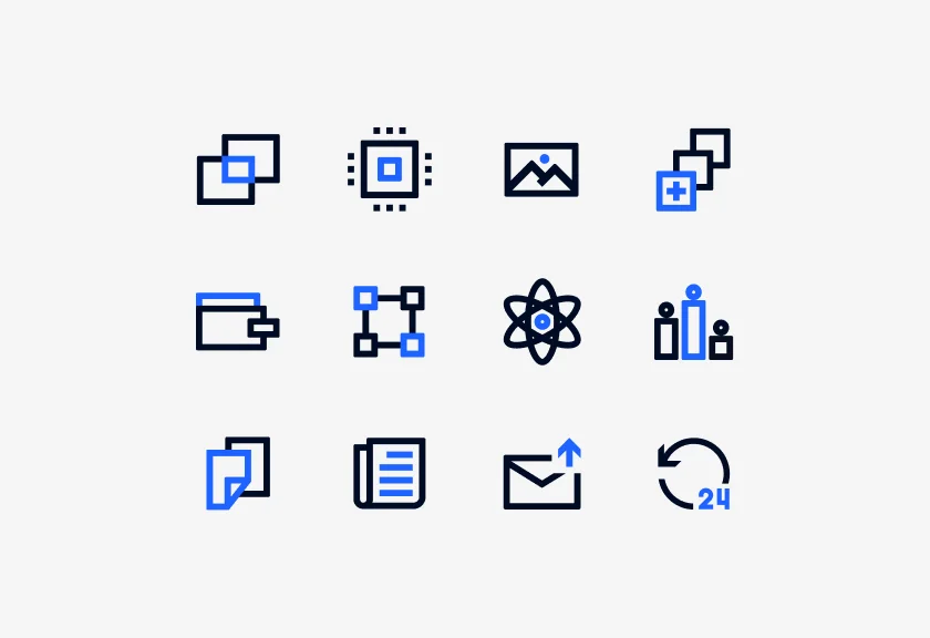
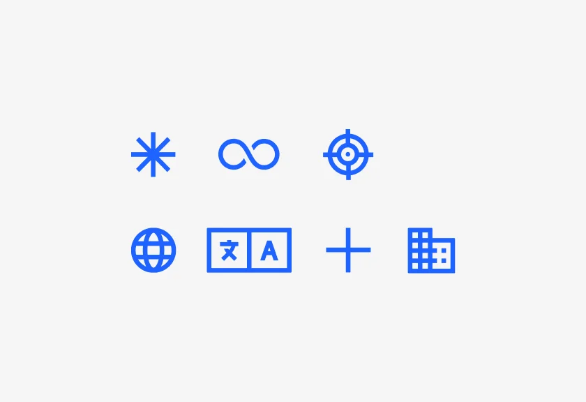
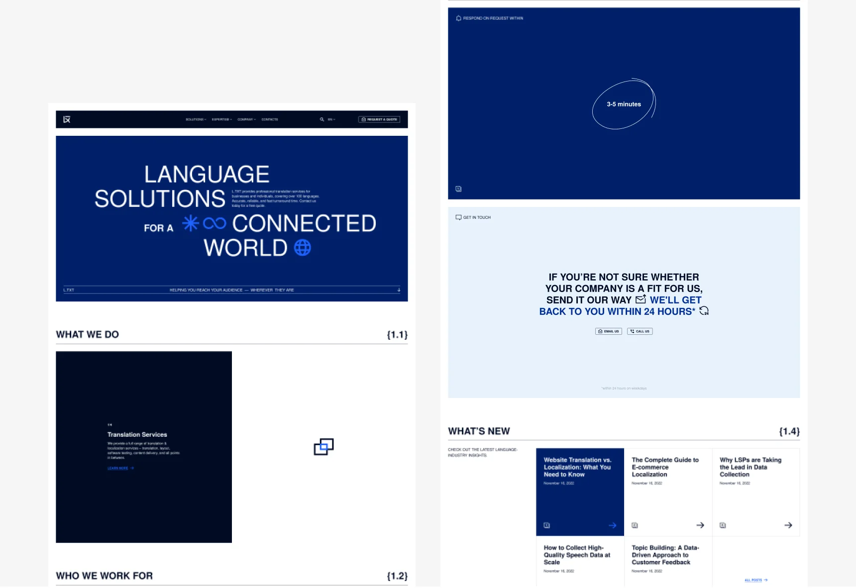
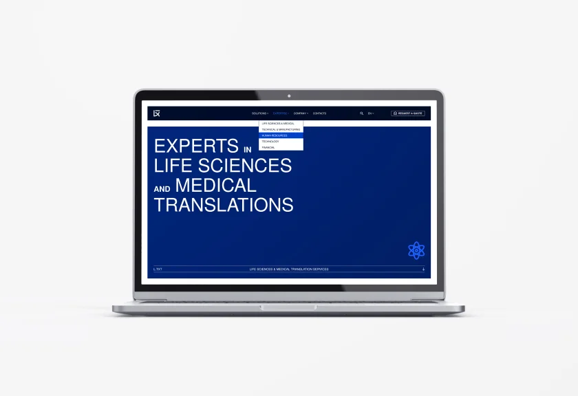
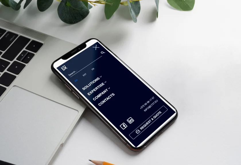
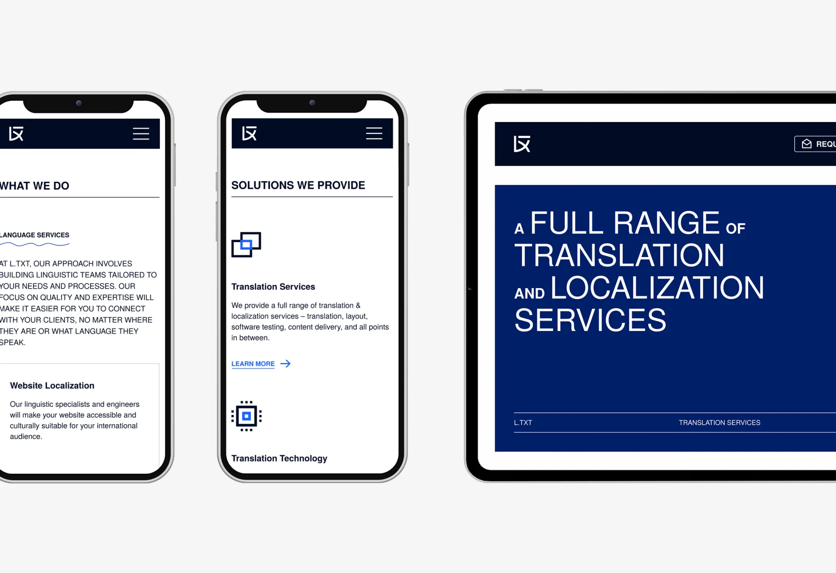
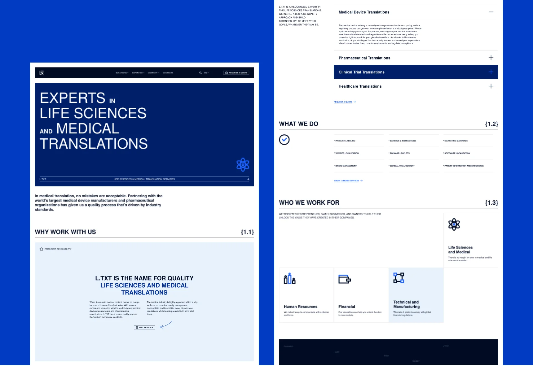
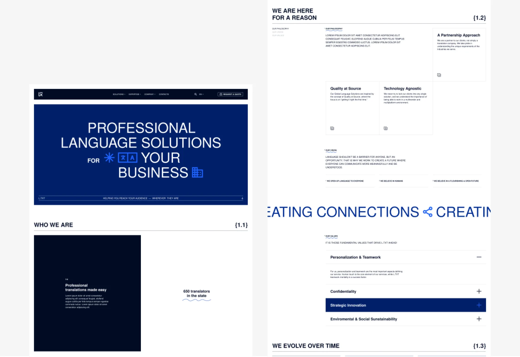
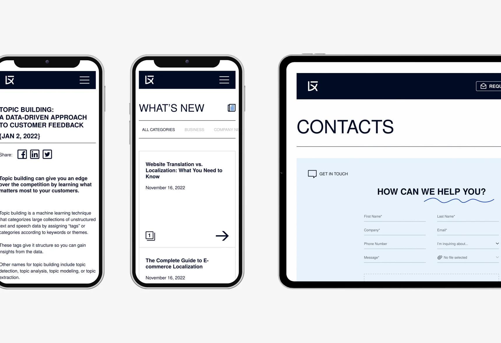

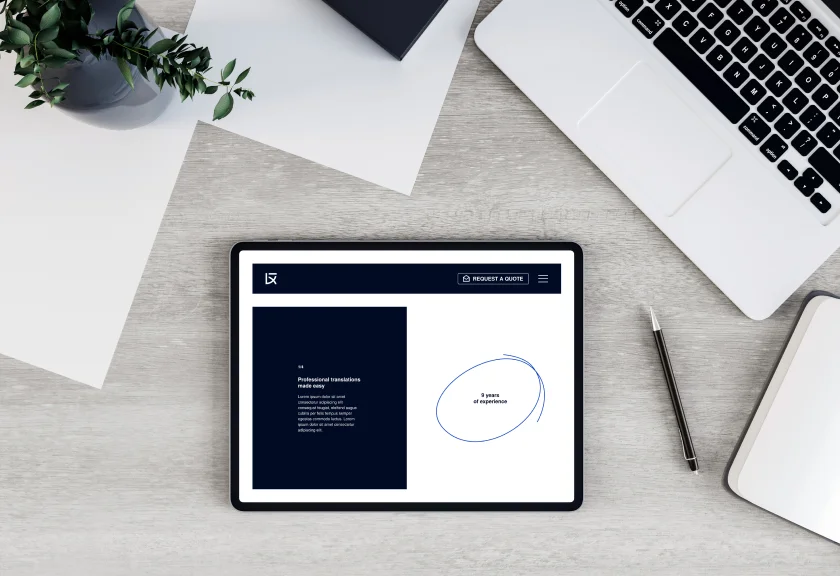
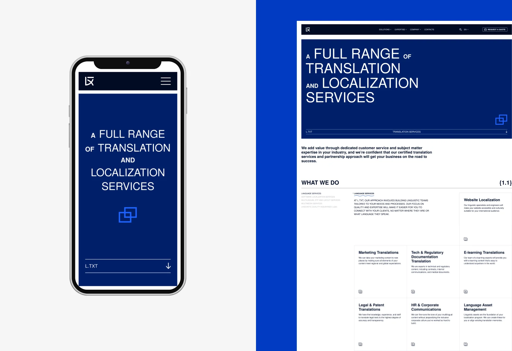
Our website features animated icons that are strategically placed to highlight important information. These dynamic elements help visitors easily grasp relevant content and make the user experience on our site more engaging.
